Qualtrics
Reimagined Homepage
Replacing a one-size-fits-all researcher tool with a purpose-built home base for half a million monthly active users.
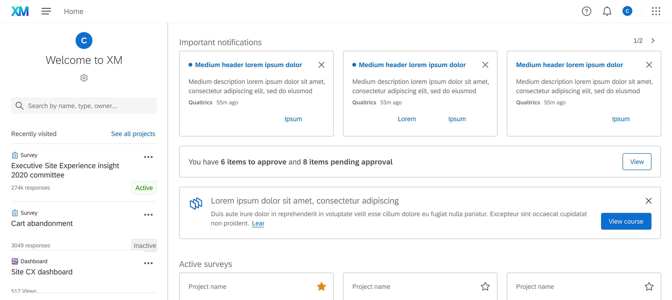
Replacing a one-size-fits-all researcher tool with a purpose-built home base for half a million monthly active users.
The problem
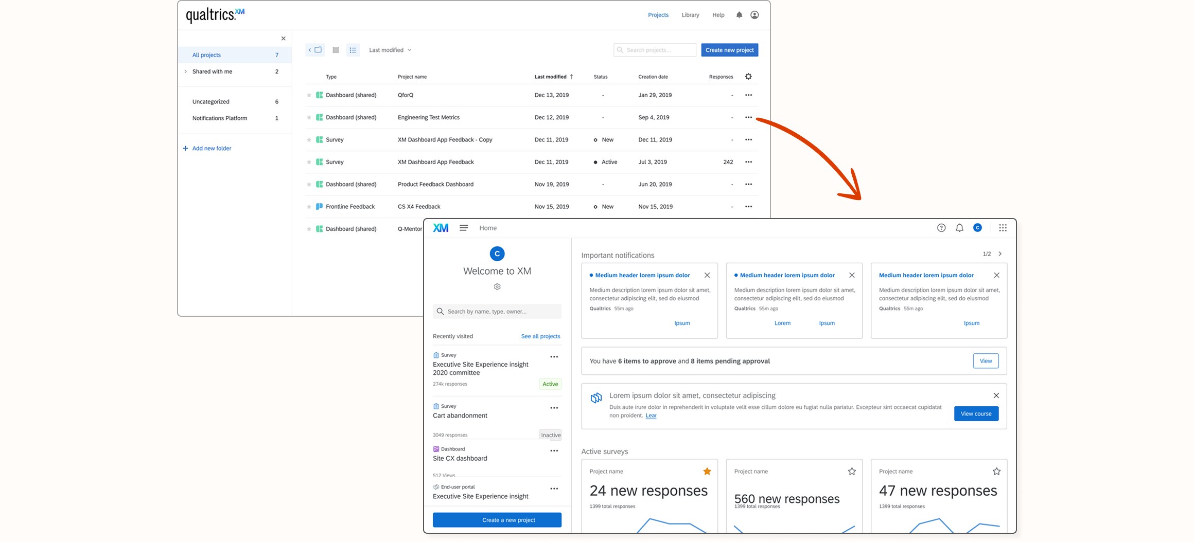
Starting out, the user landed on the project list — which worked great if you were a researcher managing many surveys. If that wasn't your role and focus, you had to dig through every individual project just to find insights, with no aggregated, high-level view of how those projects were actually doing. In other words, it could take many clicks to get to the real, impactful information.
Before & after
The old, one-size-fits-all landing experience compared to the new, purpose-built homepage.
Design process + problem definition
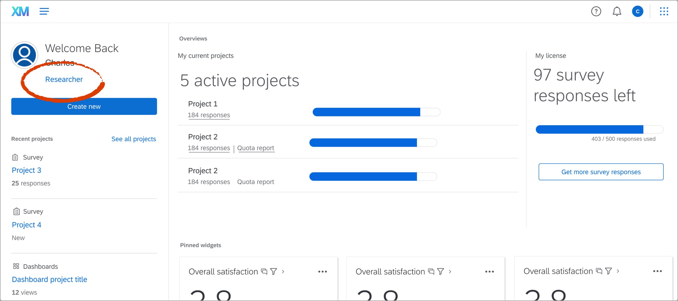
As part of our early explorations, our assumption was that a role-based homepage would help us bubble up the relevant information to a user. Research proved that wrong: most Qualtrics users are power users wearing multiple hats, so a role-based split would have left people bouncing between views that didn't match how they actually worked.
Role-based designs
When tested, users found that this approach lacked the nuance they needed.
Design iteration and buy-in
This started with a series of stakeholder workshops across every internal team that wanted a presence on the homepage, running concepts through many iterations and validating the outputs with usability research along the way. At the time, Qualtrics leadership wanted to drive more traffic to certain product areas, so we prioritized working with the Ticketing team, XM Directory team, and the XFlows (or automations) team. I built a system where partner teams brought what they wanted represented on the homepage, and we worked together to define the success metrics and top-level information their users actually needed.
Information architecture exploration
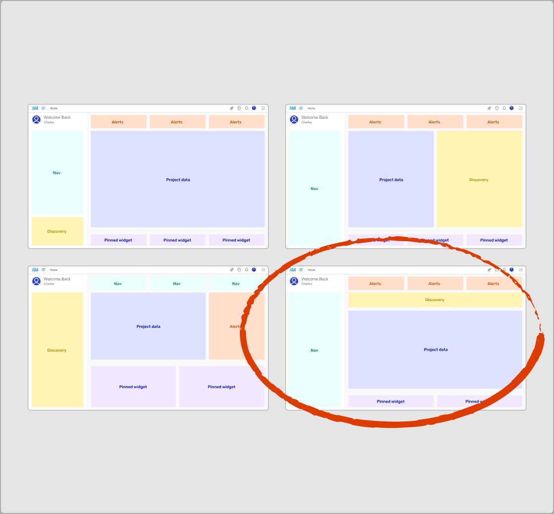
We explored many different types of layouts and landed on the one that prioritizes access to alerts that we deemed urgent and navigation in the left panel.
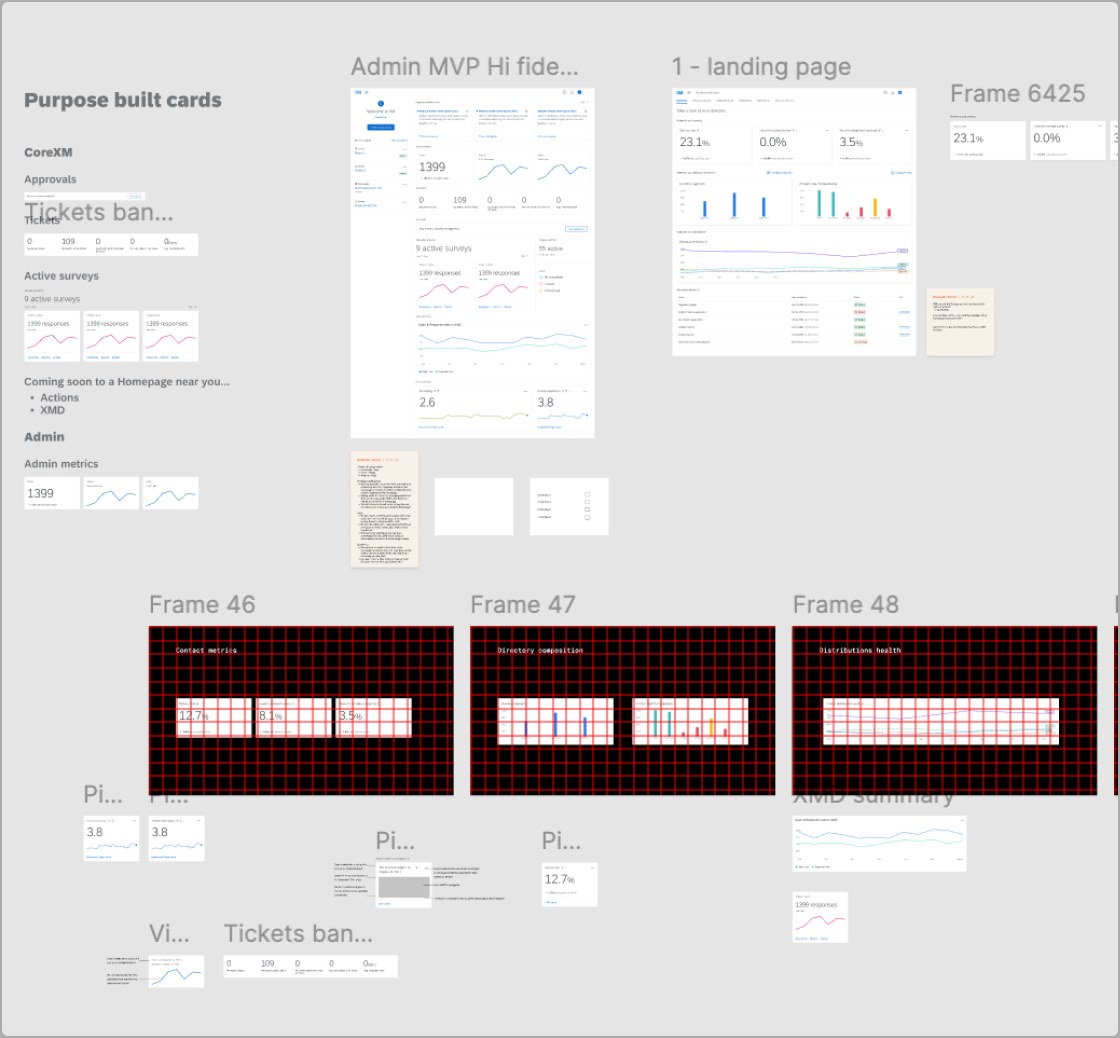
Cross-team workshops to design cards for their sections
Once we knew what sections we had, we started working with internal partners to develop the cards that would live on the homepage to represent their product unit.
Systems thinking
From our series of cross-team collaboration sessions, I turned all the inputs and user needs into a flexible card framework and a set of guidelines. I delivered specs iteratively, kept a running changelog so every change was documented, and worked closely with my PM and engineering partners throughout to make sure what shipped actually held up.
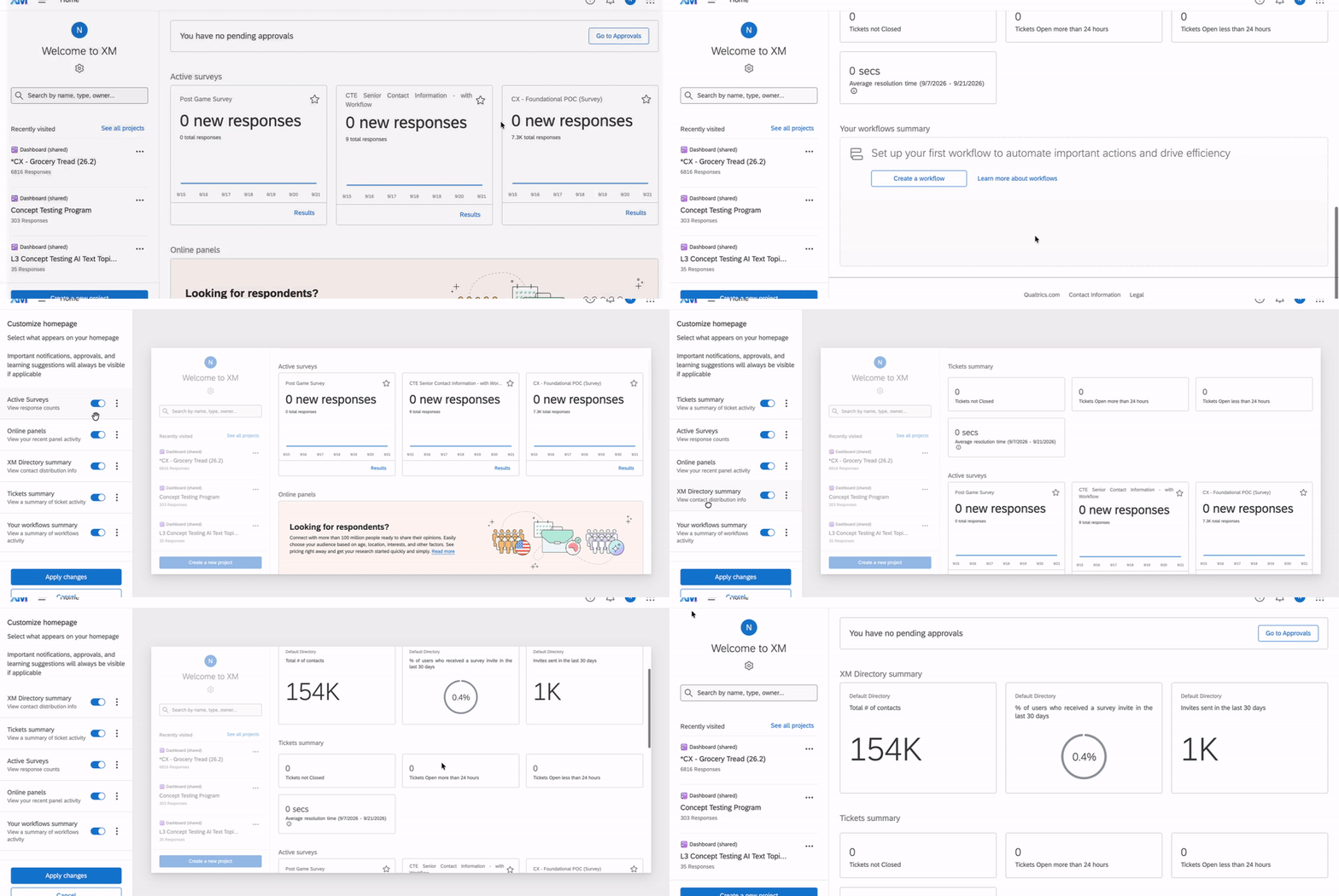
The card framework
The guidelines that let each partner team bring their own metrics and top-level info.
The outcome
We created a phased, change-managed launch — and it held up. We knew that people didn't want their cheese moved, so to speak. I worked with the survey editing team to pilot a change management framework I designed to make sure that our users' time was respected and they had the ability to opt in to see the changes and then opt back out if they wanted. We gave them an end date so they knew when the old experience would be deprecated, and linked them to help pages in case they had more questions.
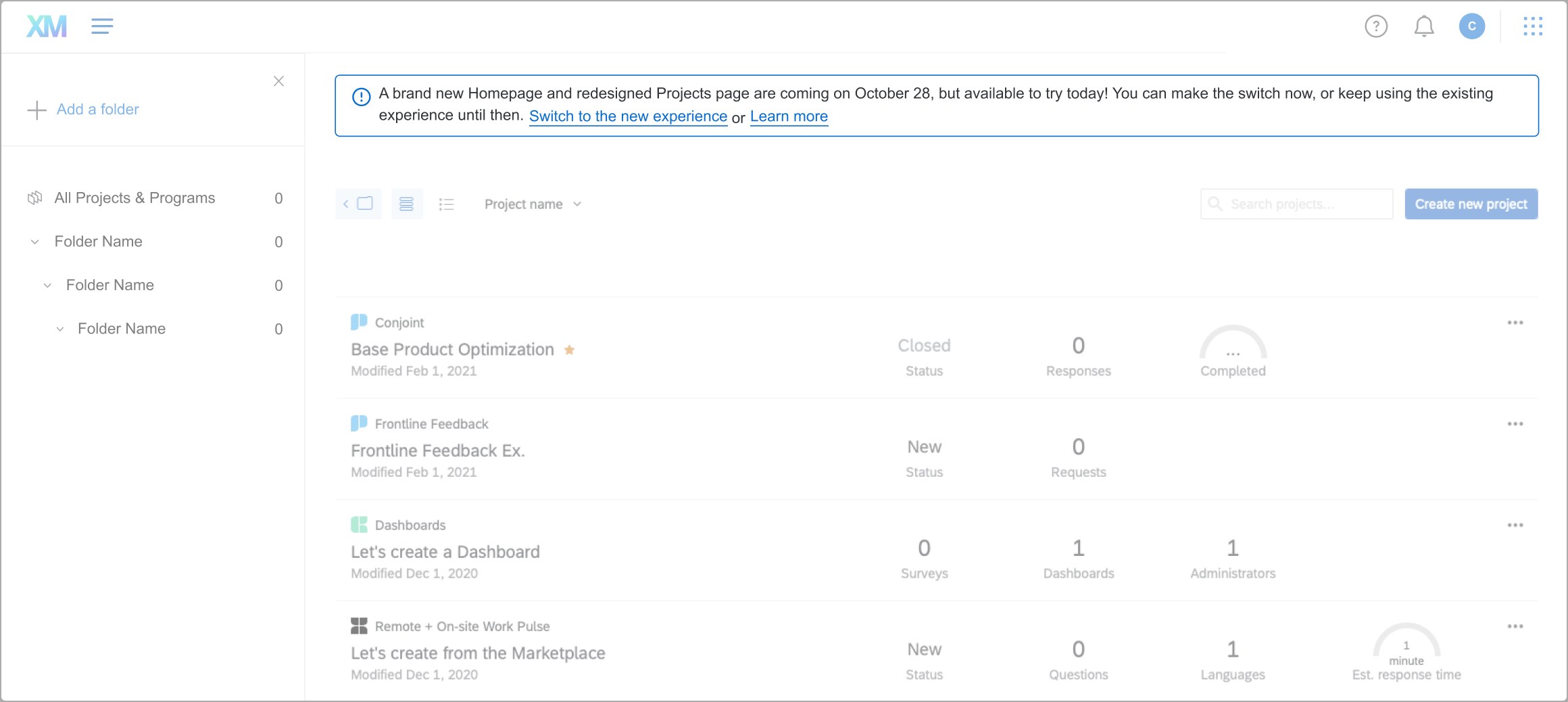
Change management rollout
A phased, communicated launch sequence that allowed people to opt out at first if they wanted to get their bearings before fully committing.
The outcome
We tracked adoption through Amplitude following the launch plan and found out it was fairly successful! Of course there were some people who wanted to see changes, which we recorded for follow-up work, but mostly people who landed on the homepage engaged with it, and the redesign hit its CSAT target among roughly half a million monthly active users.
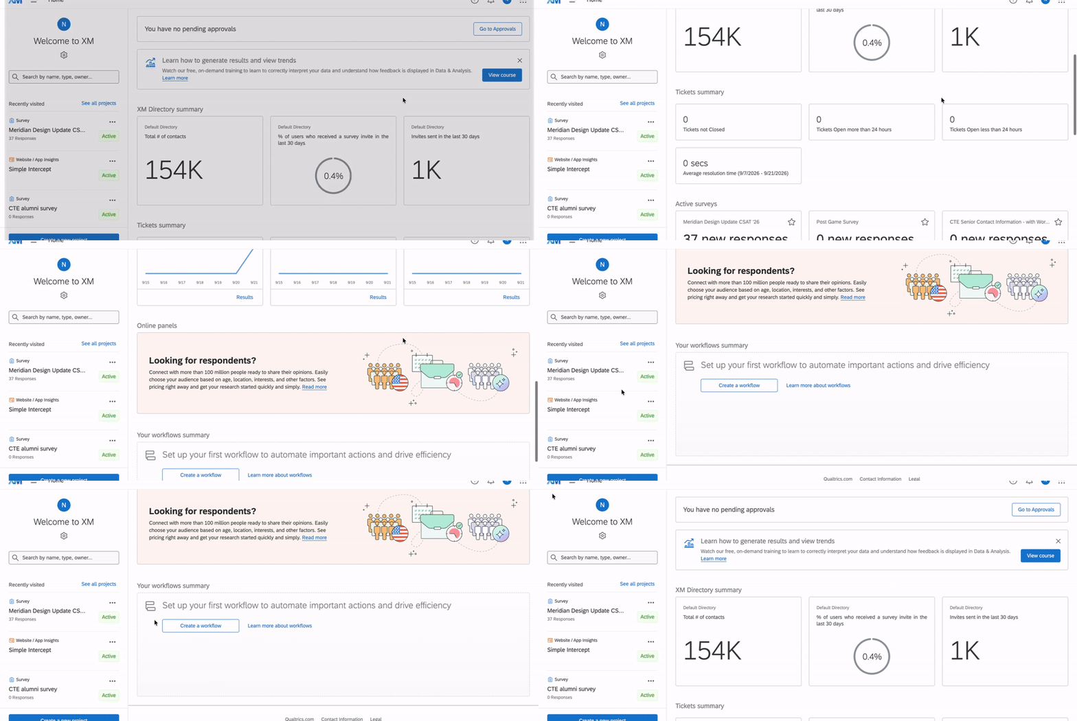
The final design
We used Amplitude hooks to track click-through, opt-outs, and CSAT after launch.