Qualtrics
Notification Platform
Building Qualtrics' first notification system — turning pre-existing data patterns into a system of alerts that help users understand what needs their attention.
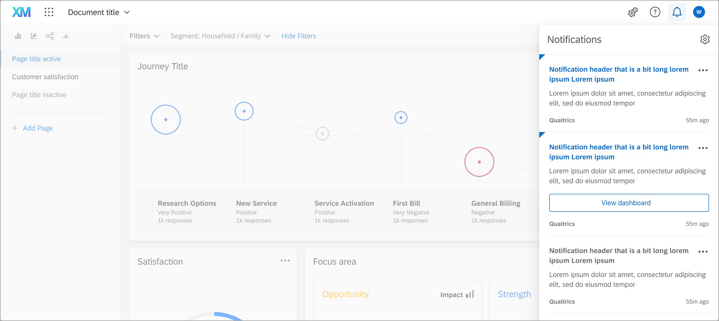
Building Qualtrics' first notification system — turning pre-existing data patterns into a system of alerts that help users understand what needs their attention.
The problem
Before notifications, there was no way for users to know what was going on with their projects without clicking multiple levels deep into them — scouring dashboards, constantly checking operational health and response rates just to figure out what needed their attention. We felt like this was a clear, table-stakes gap in a mature enterprise platform like Qualtrics. The idea that got this project moving was simple: Qualtrics already had the data to recognize those patterns itself, it just needed to surface them.
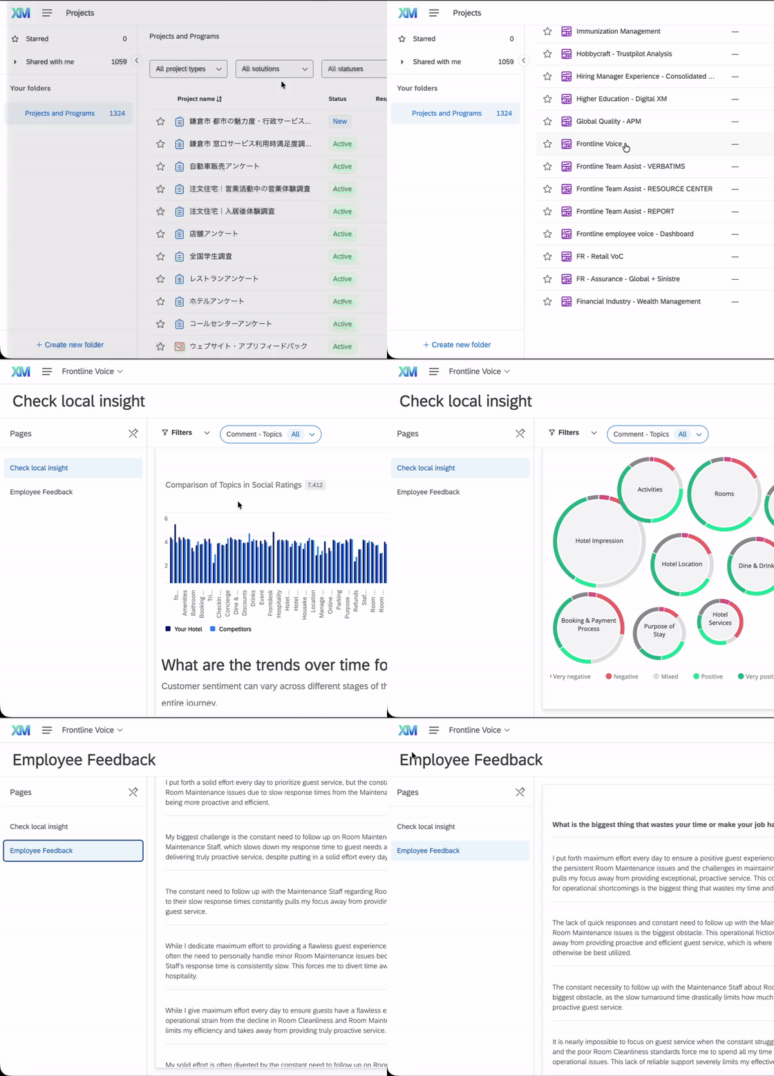
Manual monitoring
Customers had to scour dashboards, response rates, ticketing, etc. just to know what needed their attention, potentially diving multiple levels deep for one insight.
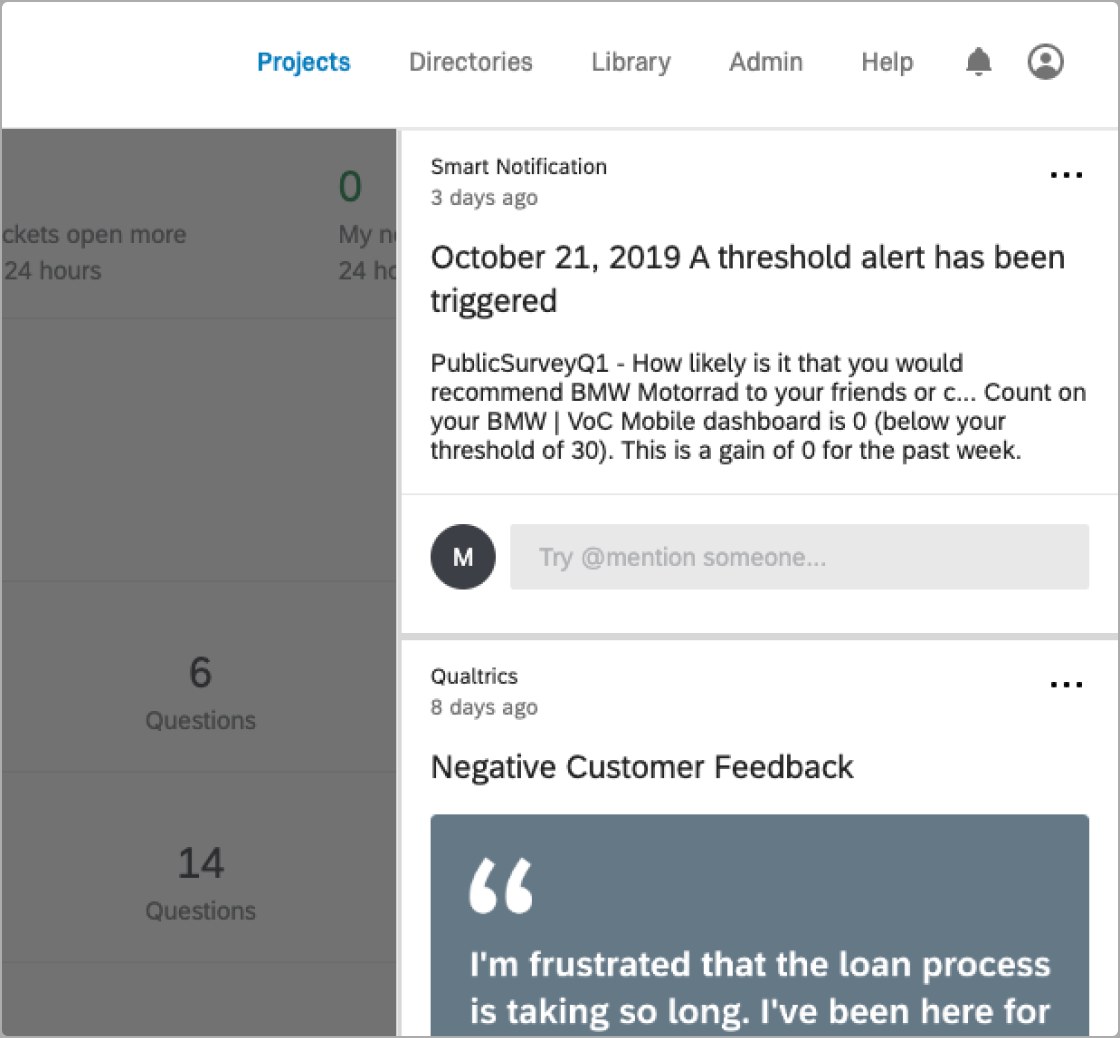
Automations feed — the closest equivalent
While this feed would have been helpful, it was limited to updating users about automation statuses and wasn't globally visible or actionable.
Problem definition + starting with UX principles
During the problem definition stage, we wanted to start with UX principles to guide future decision making and to create perspective alignment within the cross-functional product unit.
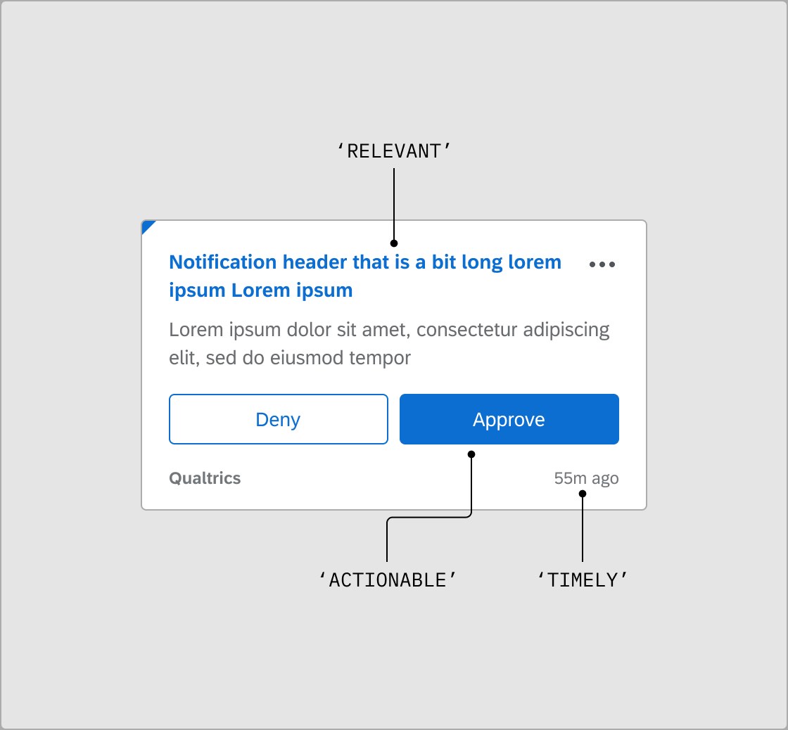
Anatomy of a notification
We used the principles to make early decisions about what should live in a notification before validating user expectations in research.
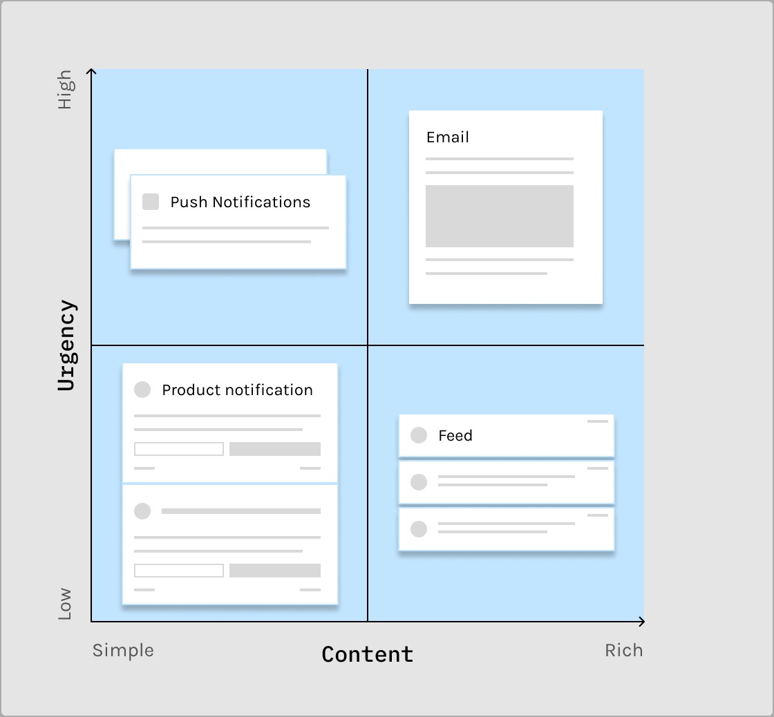
Channel framework
We developed a framework to determine what channel a notification fell into once it was sent. This, and other frameworks, gave us a jumping-off point for the designs.
Gathering requirements
Once we had our basic framework, we used user research to understand the content strategy of the notification system. Users had expectations for what they expected to see, so all we had to do was ask them what they needed to be informed of. We used these findings and the requirements being pushed to us from an intake form I developed for our partner teams to develop a set of content buckets. These buckets are what would eventually turn into categories in the notification settings for people to be able to configure their notifications at a more granular level. One thing that was clear for us was that we didn't want this to be a dumping ground for irrelevant information, so we leaned heavily on our principles when intaking requirements.
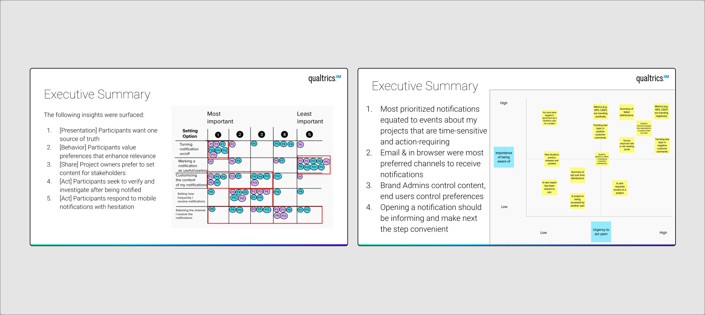
Content study screenshot
We got a lot of insight from asking our users what they needed to see that helped us build out our categories!
Design iteration
From the research and requirements we gathered, I iterated through the actual touchpoints of the system outside of the notification itself: the bell icon ingress, the notification settings, and a set of CTA guidelines that gave every internal team a consistent pattern to follow when requesting a new notification and created expectations for users clicking on a CTA.
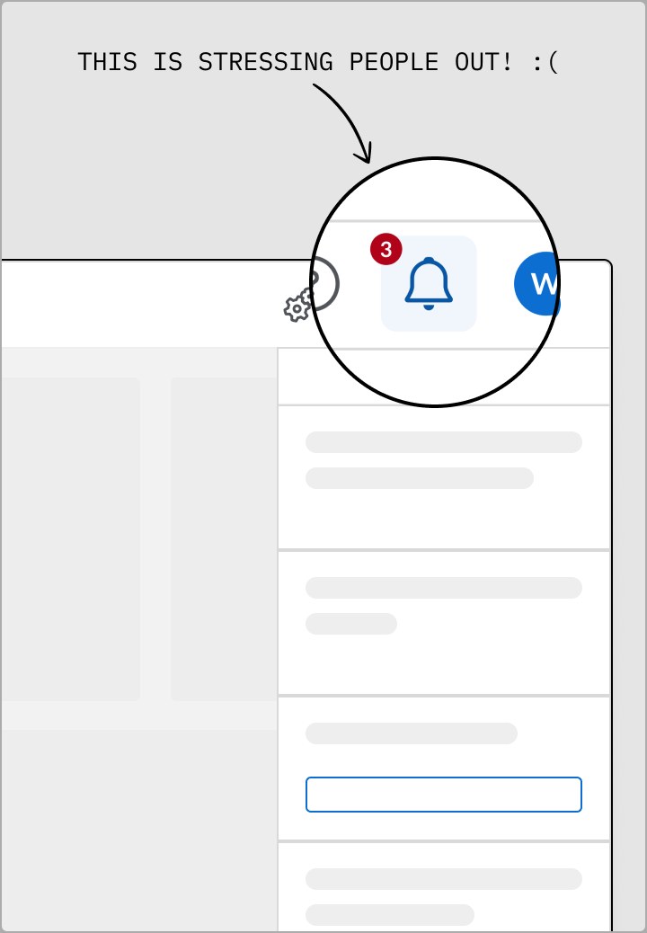
Bell icon ingress and badge
We learned that users got less anxious from seeing a dot indicator vs. a counter, which was surprising to us.
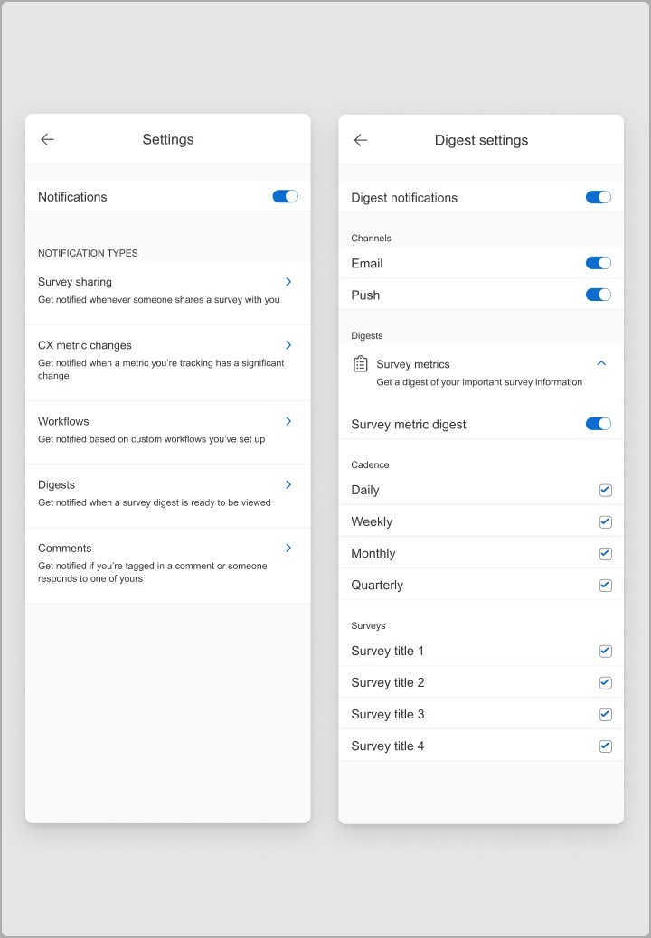
Notification settings
The content buckets we created turned into toggles that users could turn on and off for more control.
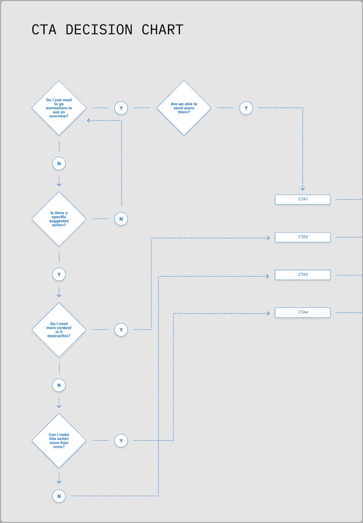
CTA guidelines
With one of our principles being "actionable," I knew that our CTAs needed to build consistent expectations.
The outcome
After the pivot to a dedicated notifications platform, monthly active users jumped from 50 to 8,000 in the first month of release. Growth kept climbing from there, and it changed behavior, too — users who clicked a survey-share notification came back to the editor noticeably more often than before their first click.
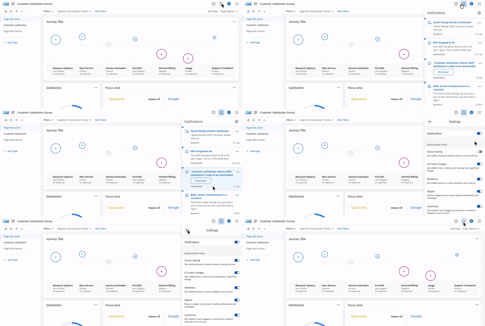
Qualtrics' first universal notification system
We used Amplitude to track usage and to create future-facing product updates.